npm i --save @skhye05/multi-select
- Version: 1.0.4
- GitHub: https://github.com/skhye05/nativescript-plugins
- NPM: https://www.npmjs.com/package/%40skhye05%2Fmulti-select
- Downloads:
- Last Day: 0
- Last Week: 0
- Last Month: 0
Nativescript Multi Select 


Overview
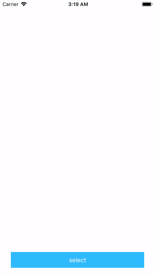
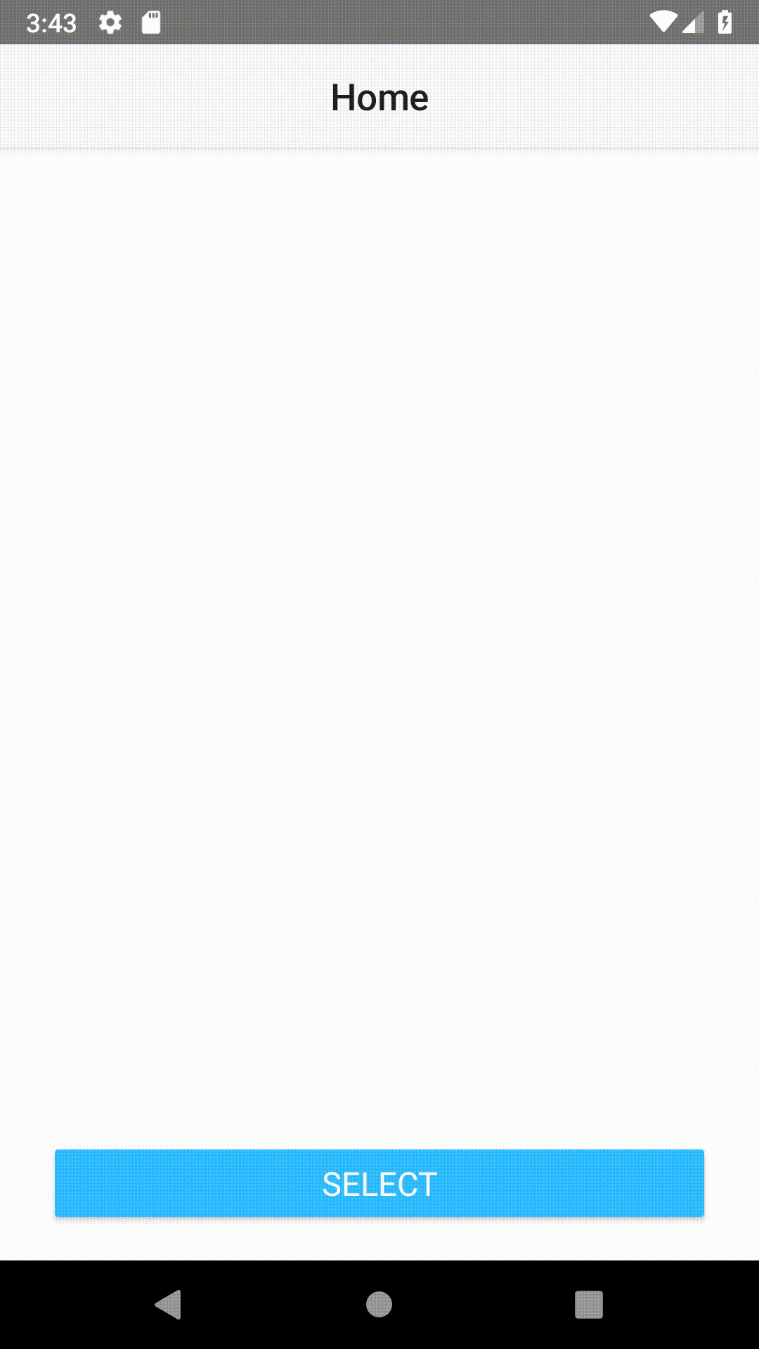
Nativescript Multi Select is a popup dialog which provides multi selection, search through list and return the selected items.
Installation
tns plugin add @skhye05/multi-selectUsage
 TypeScript
import { MultiSelect, AShowType } from '@skhye05/multi-select';
import { MSOption } from '@skhye05/multi-select';

let MSelect = new MultiSelect();
let selectedItems = ["moi-a", "moi-b"];

const options: MSOption = {
  title: "Please Select",
  selectedItems: this._selectedItems,
  items: [
    { name: "A", value: "moi-a" },
    { name: "B", value: "moi-b" },
    { name: "C", value: "moi-c" },
    { name: "D", value: "moi-d" },
  ],
  bindValue: 'value',
  displayLabel: 'name',
  onConfirm: selectedItems => {
    selectedItems = selectedItems;
    console.log("SELECTED ITEMS => ", selectedItems);
  },
  onItemSelected: selectedItem => {
    console.log("SELECTED ITEM => ", selectedItem);
  },
  onCancel: () => {
    console.log('CANCEL');
  },
  android: {
    titleSize: 25,
    cancelButtonTextColor: "#252323",
    confirmButtonTextColor: "#70798C",
  },
  ios: {
    cancelButtonBgColor: "#252323",
    confirmButtonBgColor: "#70798C",
    cancelButtonTextColor: "#ffffff",
    confirmButtonTextColor: "#ffffff",
    showType: AShowType.TypeBounceIn
  }
};

MSelect.show(options);
Angular
import { Component, OnInit, NgZone } from "@angular/core";
import { MultiSelect, AShowType } from '@skhye05/multi-select';
import { MSOption } from '@skhye05/multi-select';

@Component({
 // ...
})
export class SomeComponent implements OnInit {

  private _MSelect: MultiSelect;
  private predefinedItems: Array<any>;
  public selectedItems: Array<any>;

  constructor(private zone: NgZone) {
    this._MSelect = new MultiSelect();
    this.predefinedItems = ["moi-a", "moi-b"];
  }

  ngOnInit(): void {
  }


  public onSelectTapped(): void {
    const options: MSOption = {
      title: "Please Select",
      selectedItems: this.predefinedItems,
      items: [
        { name: "A", value: "moi-a" },
        { name: "B", value: "moi-b" },
        { name: "C", value: "moi-c" },
        { name: "D", value: "moi-d" },
      ],
      bindValue: 'value',
      displayLabel: 'name',
      onConfirm: selectedItems => {
        this.zone.run(() => {
          this.selectedItems = selectedItems;
          this.predefinedItems = selectedItems;
          console.log("SELECTED ITEMS => ", selectedItems);
        })
      },
      onItemSelected: selectedItem => {
        console.log("SELECTED ITEM => ", selectedItem);
      },
      onCancel: () => {
        console.log('CANCEL');
      },
      android: {
        titleSize: 25,
        cancelButtonTextColor: "#252323",
        confirmButtonTextColor: "#70798C",
      },
      ios: {
        cancelButtonBgColor: "#252323",
        confirmButtonBgColor: "#70798C",
        cancelButtonTextColor: "#ffffff",
        confirmButtonTextColor: "#ffffff",
        showType: AShowType.TypeBounceIn
      }
    };

    this._MSelect.show(options);
  }
}
Vue
Vue
<script>
  import {
    MultiSelect,
    AShowType
  } from "@skhye05/multi-select";
  const MSelect = new MultiSelect();
  let predefinedItems = ["moi-a", "moi-b"];

  export default {
    data() {
    },
    methods: {
      onSelectTapped() {
        const that = this;
        const options = {
          title: "Please Select",
          selectedItems: predefinedItems,
          items: [{
              name: "A",
              value: "moi-a"
            },
            {
              name: "B",
              value: "moi-b"
            },
            {
              name: "C",
              value: "moi-c"
            },
            {
              name: "D",
              value: "moi-d"
            }
          ],
          bindValue: "value",
          displayLabel: "name",
          onConfirm: _selectedItems => {
            that.selectedItems = _selectedItems;
            console.log("SELECTED ITEMS => ", _selectedItems);
          },
          onItemSelected: selectedItem => {
            console.log("SELECTED ITEM => ", selectedItem);
          },
          onCancel: () => {
            console.log("CANCEL");
          },
          android: {
            titleSize: 25,
            cancelButtonTextColor: "#252323",
            confirmButtonTextColor: "#70798C"
          },
          ios: {
            cancelButtonBgColor: "#252323",
            confirmButtonBgColor: "#70798C",
            cancelButtonTextColor: "#ffffff",
            confirmButtonTextColor: "#ffffff",
            showType: AShowType.TypeBounceIn
          }
        };

        MSelect.show(options);
      }
    }
  };
</script>
API
MultiSelect
| Property | Type | Description |
|---|---|---|
show(options: MSOption) |
() : void |
Show Multi Select Dialog |
MSOption
| Property | Type | Description |
|---|---|---|
title |
string |
Dialog Title |
confirmButtonText |
string |
confirm button text optional |
cancelButtonText |
string |
cancel button text optional |
selectedItems |
Array<any> |
predefined items optional |
items |
Array<any> |
items/list that will be display |
bindValue |
string |
the value that will determine the property which will be return when an item is selected optional |
displayLabel |
string |
the value that will determine the property which will be display in the list optional |
ios |
MSiOSOption |
ios options optional |
android |
MSAndroidOption |
android options optional |
onConfirm: (selectedItems: Array<any>) => void |
Function Callback |
callback which fires when the selection has been confirm/done |
onItemSelected: (selectedItem: any) => void |
Function Callback |
callback which fires when an item has been selected optional |
onCancel: () => void |
Function Callback |
callback which fires when the cancel button is tapped optional |
MSAndroidOption (for android)
| Property | Type | Description |
|---|---|---|
titleSize |
number |
optional |
confirmButtonTextColor |
string |
optional |
cancelButtonTextColor |
string |
optional |
MSiOSOption (for ios)
| Property | Type | Description |
|---|---|---|
cancelButtonBgColor |
string |
optional |
confirmButtonBgColor |
string |
optional |
confirmButtonTextColor |
string |
optional |
cancelButtonTextColor |
string |
optional |
showType |
number |
popup view show type, default by AAPopupViewShowTypeFadeIn optional |
dismissType |
number |
popup view dismiss type, default by AAPopupViewDismissTypeFadeOut optional |
itemColor |
string |
item text color optional |
iOS Popup: Animation AShowType ENUM
| Property | Value |
|---|---|
| TypeNone | 0 |
| TypeFadeIn | 1 |
| TypeGrowIn | 2 |
| TypeShrinkIn | 3 |
| TypeSlideInFromTop | 4 |
| TypeSlideInFromBottom | 5 |
| TypeSlideInFromLeft | 6 |
| TypeSlideInFromRight | 7 |
| TypeBounceIn | 8 |
| TypeBounceInFromTop | 9 |
| TypeBounceInFromBottom | 10 |
| TypeBounceInFromLeft | 11 |
| TypeBounceInFromRight | 12 |
iOS Popup: Animation ADismissType ENUM
| Property | Value |
|---|---|
| TypeNone | 0 |
| TypeFadeOut | 1 |
| TypeGrowOut | 2 |
| TypeShrinkOut | 3 |
| TypeSlideOutToTop | 4 |
| TypeSlideOutToBottom | 5 |
| TypeSlideOutToLeft | 6 |
| TypeSlideOutToRight | 7 |
| TypeBounceOut | 8 |
| TypeBounceOutToTop | 9 |
| TypeBounceOutToBottom | 10 |
| TypeBounceOutToLeft | 11 |
| TypeBounceOutToRight | 12 |
Author
Jonathan Mayunga, [email protected]
Credits
- For Android we're using the MultiSelectDialog by abumoallim,
- For iOS AAMultiSelectController by Alex Ao.
License
Apache License Version 2.0, January 2004