- Version: 2.2.6
- GitHub: https://github.com/davecoffin/nativescript-filterable-listpicker
- NPM: https://www.npmjs.com/package/nativescript-filterable-listpicker
- Downloads:
- Last Day: 0
- Last Week: 0
- Last Month: 0
nativescript-filterable-listpicker
The native listpickers on iOS and Android are not great for huge lists that users may want to filter. This plugin is a modal that offers filtering capabilities.

Installation
tns plugin add nativescript-filterable-listpickerUsage
In order to use the plugin, you must place it on your page within a namespace. Wherever you place it, thats where it will display when invoked, but it will be hidden until you invoke it. The best way to use this is to place it on top of your page content like this:
NativeScript Core
<Page xmlns="http://schemas.nativescript.org/tns.xsd" loaded="pageLoaded" class="page" xmlns:ui="nativescript-filterable-listpicker">
    <GridLayout rows="" columns="">
        <Image src="https://i.pinimg.com/736x/a4/40/04/a4400453bad6d581ec203ad1455d0c8f--pretty-pics-pretty-pictures.jpg" stretch="aspectFill" />
        <GridLayout rows="*, auto, *">
            <StackLayout height="300">
                <Button text="Pick Your Fav Language" tap="{{showPicker}}" height="50" width="250" style="background-color: rgba(0,0,0,0.7); color: white; border-radius: 25; margin-bottom: 20;margin-bottom:15"/>
                <Button text="Pick Your Favorite Animal" tap="{{showNewThings}}" height="50" width="250" style="background-color: rgba(0,0,0,0.7); color: white; border-radius: 25;margin-bottom:15"/>
                <Button text="Use it like Autocomplete" tap="{{showPickerAsAutocomplete}}" height="50" width="250" style="background-color: rgba(0,0,0,0.7); color: white; border-radius: 25;"/>

                <Label text="{{selection ? 'I chose ' + selection : ''}}" textWrap="true" style="font-size: 30; text-align: center; margin-top: 50; font-weight: bold; color: white;" />
            </StackLayout>
        </GridLayout>
        <!-- props to tes: enableSearch="false" showCancel="false" headingTitle="Testing" -->
        <ui:FilterableListpicker focusOnShow="false" id="myfilter" blur="dark" dimmerColor="rgba(76,196,211,0.7)"  hintText="Type to filter..." source="{{listitems}}" canceled="{{cancelFilterableList}}" itemTapped="{{itemTapped}}" />
    </GridLayout>
</Page>
Then in your code...
public showPicker() {
    page.getViewById('myfilter').show();
}

public itemTapped(args) {
    alert(args.selectedItem + ' was tapped!')
}

public cancelFilterableList() {
    // this gets called if the user cancels the modal.
}
Use as Autocomplte
You can use nativescript-filterable-list-picker as autocomplete from your backend server or third party provider like Google Place API please see demo
If you bind source before use autocomplete function this resources will be cloned and until the TextField is empty the Filterable-listpicker wil be populated with that resources, if you write then the autocomplete take the relay.
let API_KEY = "__YOUR_GOOGLE_API_KEY";

private filterableListpicker: FilterableListpicker;
private page: Page;
constructor(page: Page) {
    super();
    this.page = page;
    // Get filterableListpicker instance
    this.filterableListpicker = (<any>this.page.getViewById('myfilter'));
    MyModel = this;
}

public showPickerAsAutocomplete() {
    // IMPORTANT : Set `isAutocomplete` to true to enable `textChange` listener
    this.filterableListpicker.isAutocomplete = true;
    this.filterableListpicker.show(frame.topmost());

    this.filterableListpicker.autocomplete((data) => {
        let url = placesApiUrl + "?input=" + data.value + "&language=fr_FR&key=" + API_KEY;
        http.getJSON<Predictions>(url).then((res) => {
            //console.dir(res)
            const airportsCollection = res.predictions;
            const items = [];
            for (let i = 0; i < airportsCollection.length; i++) {
                items.push({
                    title: airportsCollection[i].description,
                    description: "",
                    source: airportsCollection[i]
                });

            }
            this.set("listitems", items)
        }).catch((err) => {
            const message = 'Error fetching remote data from ' + url + ': ' + err.message;
            console.log(message);
            alert(message);
        });
    });
}
NativeScript Angular
In angular, you have to register the element in your app component like so:
// app.component.ts
import {registerElement} from "nativescript-angular/element-registry";
registerElement("FilterableListpicker", () => require("nativescript-filterable-listpicker").FilterableListpicker);
Then use it in your templates like...
<GridLayout>
    <Image src="res://nicebackgroundimage.jpg"></Image>
    <StackLayout>
        <Label text="Whats your favorite programming language?"></Label>
        <Button text="Choose a Language" (tap)="showPicker()"></Button>
    </StackLayout>
    <FilterableListpicker #myfilter blur="dark" hintText="Type to filter..." [source]="listitems" (canceled)="cancelFilterableList($event)" (itemTapped)="itemTapped($event)"></FilterableListpicker>
</GridLayout>
Then in your code...
@ViewChild('myfilter') myfilter: ElementRef;

cancelFilterableList() {
    console.log('canceled');
}

itemTapped(args) {
    alert(args.selectedItem)
}

showPicker() {
    this.myfilter.nativeElement.show();
}
Note: When calling show, as of 2.1.0 you can pass in a viewContainer that the plugin will use to find the necessary elements. This allows you to use the list picker in modals now! For example, you could pass in a Page element, or a GridLayout that contains the FilterableListpicker element like this:
in android:
@ViewChild('myContainer') myContainer: ElementRef;

public function showPicker() {
  this.myfilter.nativeElement.show(this.myContainer.nativeElement);
}
Note: You can change the items in the filterable list easily by just setting the source to an array in your observable, and changing then changing the array. Take a look at the demo project for an example.
Source Array
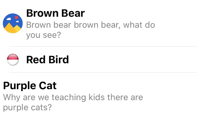
As of version 2.0, you can supply either an array of strings, or an array of objects. The object must contain a parameter called title, and thats what will display as the title. Check out the gif above to see what the picker looks like when supplying an object. The 3 parameters the picker will display
if in your object are:
| Property | Description |
|---|---|
| title | The title, this is what your list will be filtered on, and it will display in bold. |
| image | OPTIONAL: This will display to the left of the title. |
| description | OPTIONAL: This will display under the title smaller and in gray. |
Here's some example code:
public listitems = [
    {
        "image": "https://lh3.googleusercontent.com/gN6iBKP1b2GTXZZoCxhyXiYIAh8QJ_8xzlhEK6csyDadA4GdkEdIEy9Bc8s5jozt1g=w300",
        "title": "Brown Bear",
        "description": "Brown bear brown bear, what do you see?"
    },
    {
        "image": "http://icons.veryicon.com/png/Flag/Rounded%20World%20Flags/Indonesia%20Flag.png",
        "title": "Red Bird"
    },
    {
        "title": "Purple Cat",
        "description": "Why are we teaching kids there are purple cats?"
    }
];
You could, for example, massage the results of an API call and use the result array of objects to display in the picker. Other parameters can be present in the objects in the array (like IDs for example), the picker will use title, image and description if they are present. Although title must be present.
Here's how it will look in the picker:
Webpack
Thanks to Mike Richards, this plugin is now compatible with webpack. Just follow the webpack instructions carefully, in particular the bundle-config.js and require("bundle-entry-points"); parts. See more here.
API
The UI element accepts the following parameters:
| Property | Default | Description |
|---|---|---|
| source | REQUIRED | The array of strings or objects (see Source Array above) you want to display in the picker. |
| hintText | Enter text to filter... | This is the text that shows up as the hint for the textfield used to filter the list. |
| listWidth | 300 | The width of the modal element. |
| listHeight | 300 | The height of the modal element. |
| focusOnShow | false | true or false, indicating if the textfield should be in focus (and the keyboard open) when the listpicker is shown. |
| dimmerColor | rgba(0,0,0,0.8) | The color of the dimmer behind the modal. You can set it to transparent, or any color supported by NativeScript (ex: rgba(255,255,255,0.5), red, #0088CC) |
| blur | none | iOS only. Pass dark or light for a dark or light blur effect. If this is passed, dimmerColor is ignored on iOS but respected on Android. |
| itemTapped(args) | This is the function called when an item in the list is tapped. The modal is automically dismissed, and you can access to item tapped with args.selectedItem. |
|
| canceled | This is just a function to call if the user cancels, probably rarely neccessary. | |
| showCancel | Show cancel button or not. | |
| enableSearch | Allow searching by showing the TextField at the top. | |
| autocomplete(fn: Function) | Allow binding listener textChangeEvent to Textfield and use the plugin as autocomplete eg.: Google Place API. |
CSS Styling
.flp-container .flp-list-container {
  border-radius: 10;
}
.flp-container .flp-list-container .flp-listview {
  background-color: white;
}

.flp-container .flp-list-container .flp-listview .flp-row {
  background-color: white;
}
/* .flp-container .flp-list-container .flp-listview .flp-row .flp-row-container {
  padding: 10;
} */
.flp-container .flp-list-container .flp-listview .flp-row .flp-image {
  margin: 10 0 10 5;
}
.flp-container .flp-list-container .flp-listview .flp-row .flp-title-container {
  margin: 10 10 10 5;
  /* margin: 0 10 0 10; */
}
.flp-container .flp-list-container .flp-listview .flp-row .flp-title-container .flp-title {
  font-weight: bold;
  font-size: 16;
}
.flp-container .flp-list-container .flp-listview .flp-row .flp-title-container .flp-description {
  color: gray;
  font-size: 13;
}
.flp-container .flp-list-container .flp-listview .flp-row .flp-title-container .flp-no-title {
  margin-left: 15;
  padding: 10 0;
}
.flp-container .flp-list-container .flp-listview .flp-row .flp-item-selected {
  color: lightblue;
}

.flp-container .flp-hint-field {
  padding: 10 15;
  height: 40;
  background-color: #E0E0E0;
  border-radius: 10 10 0 0;
}

.flp-container .flp-cancel-container {
  background-color: #E0E0E0;
  height: 40;
  border-radius: 0 0 10 10;
}

.flp-container .flp-cancel-container .flp-btn-cancel {
  font-weight: bold;
  height: 40;
  background-color: transparent;
  border-color: transparent;
  border-width: 1;
  font-size: 12;
}
License
Apache License Version 2.0, January 2004