- Version: 1.2.0
- GitHub: https://github.com/PeterStaev/nativescript-folding-list-view
- NPM: https://www.npmjs.com/package/nativescript-folding-list-view
- Downloads:
- Last Day: 0
- Last Week: 0
- Last Month: 0


A NativeScript ListView with foldable cells. Utilizes the wonderfull FoldingCell created by Ramotion!
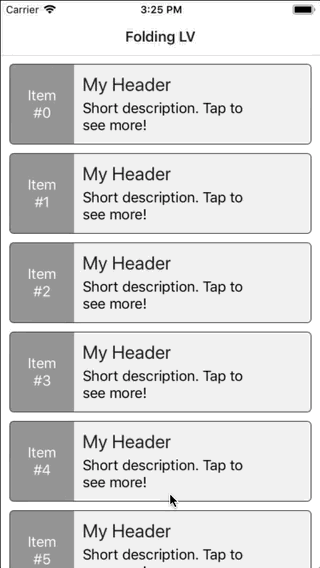
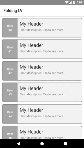
Screenshot
Installation
Run the following command from the root of your project:
tns plugin add nativescript-folding-list-view
This command automatically installs the necessary files, as well as stores nativescript-folding-list-view as a dependency in your project's package.json file.
Configuration
There is no additional configuration needed!
API
Events
-
itemLoading
Triggered when generating an item in the FoldingListView. -
loadMoreItems
Triggered when the generated items reached the end of the items property.
Static Properties
-
itemLoadingEvent - String
String value used when hooking to itemLoadingEvent event. -
loadMoreItemsEvent - String
String value used when hooking to itemTapEvent event.
Instance Properties
-
ios - UITableView
Gets the native iOS view that represents the user interface for this component. Valid only when running on iOS. -
android - android.widget.ListView
Gets the native android widget that represents the user interface for this component. Valid only when running on Android OS. -
items - Array | ItemsSource
Gets or sets the items collection of the FoldingListView. The items property can be set to an array or an object defining length and getItem(index) method. -
foregroundItemTemplate - String
Gets or sets the item template of that is displayed for folded cell. -
containerItemTemplate - String
Gets or sets the item template of that is displayed for unfolded cell. -
foldedRowHeight - Length
Gets or sets the height for folded cells in the list. -
foldsCount - number
Gets or sets the number of unfolds each cell will have. Minimum is 3. -
foldAnimationDuration - number
Gets or sets the miliseconds each fold/unfold should take. Default value is 330ms. -
backViewColor - Color
Gets or sets the color that will be displayed during the unfolding animation of the cell. -
toggleMode - boolean
Gets or sets whether the control will work in toggle mode. If set to true only a single cell can be expanded and if the user tries to expand another cell the first one will get folded. -
itemTemplateSelector - Function | string
This can be either a function that should return a string representing the template key to use, or it can be a string of a property which value will be pulled from the binding context for the current item. Note that the same template key will be used to pull the template for both the foreground and container views. -
detailDataLoader - Function
Gets or sets the a function that will be used for loading the data for the unfolded cell. By default, when this is not specified the widget binds both the folded and unfolded cells the current item. This means that the data for both views should be available in the item. If you set this function it will be called whenever the user taps on an item to unfold it. The function the currentitemandindexand must return aPromisewith the data item that should be bound to the unfolded cell.
Instance Methods
-
refresh()
Forces the FoldingListView to reload all its items. -
scrollToIndex(index: number, animated: boolean = true)
Scrolls the FoldingListView to the item with the given index. This can be either animated or not. Defaults to animated. -
invalidateChachedDetailData(index: number)
Invalidates the cahced detail data for the given index. This will cause thedetailDataLoaderto be called when the cell at the given indexed is shown or the list is refreshed. -
isItemAtIndexVisible(index: number): boolean
Checks if the given index is curently visible in the list. -
resetExpandedStates()
Resets expanded states for all cells in the list view. Useful when you are reloading the list with completely different data so all cells can start in folded state.
Usage
You need to add xmlns:flv="nativescript-folding-list-view" to your page tag, and then simply use <flv:FoldingListView/> in order to add the widget to your page. Use <flv:FoldingListView.foregroundItemTemplate/> to specify the template for folded cells and <flv:FoldingListView.containerItemTemplate/> to specify the template for unfolded cells:
<!-- test-page.xml -->
<Page xmlns="http://schemas.nativescript.org/tns.xsd"
      xmlns:flv="nativescript-folding-list-view"
      navigatingTo="navigatingTo" class="page">

    <Page.actionBar>
        <ActionBar title="Folding LV" icon="" class="action-bar">
        </ActionBar>
    </Page.actionBar>

    <GridLayout>
        <flv:FoldingListView items="{{ items }}" foldsCount="5" foldedRowHeight="95"
            detailDataLoader="detailDataLoader">
            <flv:FoldingListView.foregroundItemTemplate>
                <GridLayout columns="75, *" class="folded-cell">
                    <GridLayout row="0" col="0" rows="*, auto, auto, *" class="item-nbr">
                        <Label row="1" text="Item"/>
                        <Label row="2" text="{{ '#' + item }}"/>
                        <ActivityIndicator row="3" busy="{{ isBusyIn }}" />
                    </GridLayout>
                    <StackLayout col="1" padding="10">
                        <Label class="h2" text="My Header"/>
                        <Label class="label" textWrap="true" text="Short description. Tap to see more!"/>
                    </StackLayout>
                </GridLayout>
            </flv:FoldingListView.foregroundItemTemplate>

            <flv:FoldingListView.containerItemTemplate>
                <StackLayout rows="auto, *, auto" class="expanded-cell">
                    <Label class="item-nbr" text="{{ 'Item #' + item }}" />
                    <Label class="label" textWrap="true" text="{{ details }}" />
                    <Button id="btn" class="btn btn-primary" text="Click Me!" />
                </StackLayout>
            </flv:FoldingListView.containerItemTemplate>
        </flv:FoldingListView>
    </GridLayout>
</Page>
Multiple templates
Using mutiple templates is dones the same way as you would in the buil-tin ListView control - the wdiget provides an itemTemplateSelector property that can be either set to a function that returns the correct template key for an item or to a string from which property the value of the key will be pulled. Note that same template key will be used for both the container and foreground views. If you want to have different template only for one type of view, then you can leave the single template for the other one
<flv:FoldingListView id="lv" items="{{ items }}" foldsCount="5" foldedRowHeight="95"
    loadMoreItems="loadMoreItems" itemLoading="itemLoading" detailDataLoader="detailDataLoader"
    itemTemplateSelector="itemTemplateSelector">
    <flv:FoldingListView.foregroundItemTemplates>
        <template key="odd">
            <GridLayout columns="75, *" class="folded-cell">
                <!-- ... -->
            </GridLayout>
        </template>
        <template key="even">
            <GridLayout columns="75, *" class="folded-cell even">
                <!-- ... -->
            </GridLayout>
        </template>
    </flv:FoldingListView.foregroundItemTemplates>

    <flv:FoldingListView.containerItemTemplates>
        <template key="odd">
            <StackLayout class="expanded-cell">
                <!-- ... -->
            </StackLayout>
        </template>
        <template key="even">
            <StackLayout class="expanded-cell even">
                <!-- ... -->
            </StackLayout>
        </template>
    </flv:FoldingListView.containerItemTemplates>
</flv:FoldingListView>
export function itemTemplateSelector(item: any, index: number, items: any) {
return (index % 2 === 0 ? "even" : "odd");
}Unfolded view height requirements
Note that in order for the widget to function properly the unfolded view height must be more than two times the height of the folded view. In order to ensure this (especially in cases where you load the detail data on demand and do not know exactly the height of the item) it is a good idea to set min-height on the wrapping layout for the unfolded cells.
Using detailDataLoader to load the bound item for the unfolded cells
In many cases when you have complex layout or you want to display many details in the unfolded cells, it is a good practice to not load all that data with your folded cells items. The widget provides a function which you can use to load that data on demand when the user taps to unfold a given cell.
export function detailDataLoader(item: any, index: number) {
    item.set("isBusyIn", true);
    return new Promise((resolve, reject) => {
        setTimeout(() => {
            item.details = "< ... some very long text ... >";
            resolve(item);

            item.set("isBusyIn", false);
        }, 3000);
    });
}
Note that this simply a bound function, it is not an event! The function should return a Promise that resolves the loaded data from you backend for the given cell.
Having buttons inside the cells (Android)
Under Android there are problems for the ListView android widget to intercept tap evens in cases when you have a Button inside the cells. In order to overcome this you need to subscribe to the itemLoading event and then set the button to not be focusable:
export function itemLoading({ index, view }: ItemEventData) {
    if (isAndroid) {
        // HACK: Button inside the ListView prevents item click
        view.container.getViewById("btn").android.setFocusable(false);
    }
}
Usage in Angular
Currently the Folding List View does not support Angular projects out of the box!
Demos
This repository includes plain NativeScript demo. In order to run it execute the following in your shell:
$ git clone https://github.com/peterstaev/nativescript-folding-list-view
$ cd nativescript-folding-list-view
$ npm install
$ npm run demo-ios
This will run the NativeScript demo project on iOS. If you want to run it on Android simply use the -android instead of the -ios sufix.
Donate
bitcoin:14fjysmpwLvSsAskvLASw6ek5XfhTzskHC
