- Version: 1.0.15
- GitHub: https://github.com/bradleygore/nativescript-materialdropdownlist
- NPM: https://www.npmjs.com/package/nativescript-materialdropdownlist
- Downloads:
- Last Day: 0
- Last Week: 0
- Last Month: 0
nativescript-materialdropdownlist
Material-inspired dropdown list widget for NativeScript
Usage
Install the plugin by running this command in your project root:
tns plugin add nativescript-materialdropdownlist
<Page xmlns="http://schemas.nativescript.org/tns.xsd"
xmlns:MDL="nativescript-materialdropdownlist">
<StackLayout>
<GridLayout rows="auto" columns="*, auto">
<StackLayout>
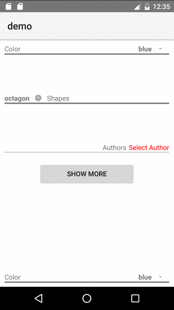
<label text="Color" />
<label style="height: 3; background-color: gray;" />
</StackLayout>
<!--Dropdown List widget-->
<MDL:MaterialDropdownList col="1" id="ddlColors"
itemsSeparatorColor="transparent" itemsRowHeight="30"
items="{{ colors }}" selectedIndex="{{ selectedColorIndex }}" >
</MDL:MaterialDropdownList>
</GridLayout>
</StackLayout>
</Page>Attributes
| Name | Description | Value Type | Default |
|---|---|---|---|
| items | list of items to bind to as data source | Array or ObservableArray | null |
| id | [Optional] prepended to generated ListView's ID as {id}_pickerList | string | '' |
| iconText | [Optional] text to use for the icon label | string | '\ue5c5' (standard dropdown icon from Material Icons) |
| itemsSeparatorColor | [Optional] pass-through to ListView to set color for line separating items | string (Color) | ListView's default (light gray) |
| itemsRowHeight | [Optional] pass-through to ListView to set height of each item in the list | number | ListView's default |
| selectedIndex | [Optional] index of the item currently selected | number | null |
| targetViewId | [Optional] target view for the backdrop (AbsoluteLayout) and the ListView to render in. This is specifically needed for best results using the widget in tab-views and modals - see demo for examples | string | null |
| indexChange | [Optional] function to call when the selected index changes | Function | N/A (uses view event .notify() mechanism) |
Custom Templates
This widget was designed with flexibility in mind, so you can use a custom template for the prompt view (the view the user taps to bring up the dropdown list) as well as define a view template for each item in the ListView.
These custom templates will need to be used if the list of items is not just strings, but objects
<MDL:MaterialDropdownList col="1" id="ddlAuthors"
    items="{{ authors }}" selectedIndex="{{ selectedAuthorIndex }}" >

    <!--Prompt or Selected Item Template-->
    <MDL:MaterialDropdownList.selectedItemView>
        <StackLayout>
            <label text="{{ selectedAuthor ? selectedAuthor.name : 'Select Author' }}" style="color: red; padding-left: 5;" />
            <label style="background-color: gray; height: 1;" />
        </StackLayout>
    </MDL:MaterialDropdownList.selectedItemView>

    <!--Template to pass to the ListView-->
    <MDL:MaterialDropdownList.itemsTemplate>
        <label style="color: red; padding-top: 5; padding-bottom: 5;" text="{{ name }}" />
    </MDL:MaterialDropdownList.itemsTemplate>
</MDL:MaterialDropdownList>
Default Prompt View
If you don't use a custom template, we kept design-ability in mind. The default prompt view's elements all have specific purposes and individual IDs and CSS classes to make styling easy. If there were an XML template for it, here is what it would be:
<grid-layout rows="auto, auto" columns="*, auto" id="mdlLayout" class="mdl-container">

    <!--Label where the value from the selected item gets put-->
    <label id="mdlSelectedValue" row="0" col="0" class="mdl-value" />

    <!--Label where the icon text gets put-->
    <label id="mdlIcon" row="0" col="1" class="mdl-icon" />

    <!--Label to hold no next but act as an underline across the entire widget - i.e. set height and background-color in a style rule-->
    <label id="mdlUnderline" row="1" col="0" colSpan="2" class="mdl-underline" />

</grid-layout>
Styling
Styling these dropdowns couldn't be simpler. Just create CSS rules based on the classes and IDs shown above. Given the dynamic nature of these types of lists, you will want to set a standard height for all dropdown lists, fortunately there's also a CSS Class specifically for those: mdl-pickerList. Here's an example of some things you can do to style these:
.mdl-backdrop {
    /*The AbsoluteLayout that acts as backdrop to the dropdown*/
    background-color: lightgrey;
}

.mdl-pickerList {
    /*common styles for ALL dropdown lists*/
    height: 80;
    min-width: 60;
    background-color: white;
    border-color: blue;
    border-width: 1;
}

/*different styles for specific lists - remember ID is container's ID + _pickerList*/
#ddlColors_pickerList {
    border-color: silver;
}

#ddlShapes_pickerList {
    border-color: orange;
    border-width: 4;
    min-width: 80;
}

#ddlAuthors_pickerList {
    min-width: 200;
}

#ddlShapes_pickerList label {
    /*If a custom itemsTemplate is not used, ListView defaults to a Label*/
    padding-top: 4;
    padding-bottom: 4;
    padding-left: 2;
    color: blue;
}
Demo
To run the demo locally, run the following commands from the root folder after pulling down this repo:
npm run setup and npm run demo.android